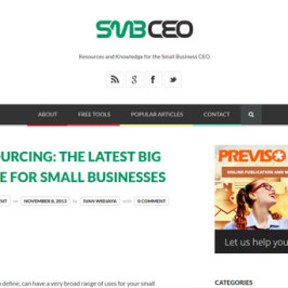
Project: SMBCEO.com What: Website redesign and rebranding via new brand identity. Why: The small business blog’s design hasn’t been updated since 2004 and by today’s standard, it looks obsolete. The site is in dire need for a redesign. The site also doesn’t have a formal logo as a brand, so we need to get this sorted out. How: SMBCEO.com is aimed at small business CEO’s audience. So we think the layout design needs to be clean and professional. The blog posts are great, but they need to be more readable. So, we decided that we need a WordPress theme which is clean, minimalist and using the good-looking Google fonts (We choose Open Sans, by the way.) We decided to go with Bloggy WordPress theme from ThemeForest. No major customization for this one – only the ‘continue reading’ button placement, social media buttons placement, and other minor updates. Logo design – we decided to go with the modern-professional look, and we decided to go with the site name without any additional branding imagery – in other words, the site name is the brand...
Learn MoreIf you own a website, the last thing you want is the visitors to leave your website as soon as they land there simply because of poor website design. There are a number of factors that need to be considered while designing a websites. All your content is useless if it not presented in a nice way. As a blog owner, it is your responsibility to keep the visitors on your blog for as long as possible. This can be achieved by making a good selection of background, providing proper navigation and using the correct size fonts. This post provides detailed information the three deadly mistakes in website design that every webmaster must avoid. Using Obscure fonts One of the common website design mistake is the use of obscure font. This creates problems for the visitors and thus they can get irritated and compelled to move to other blogs. Using weird fonts make it hard for the people to read the text on your website. When we talk about the proper font, the font size is as important as the type of font. You should check different fonts with the particular theme and chose the one that provides the best readability. Another problem associated with using weird fonts is...
Learn MoreStock images remain a fairly controversial issue in the world of design. There are some who believe that it is lazy to use someone else’s work, even if it is bought fairly. Maybe that is true; certainly, it is the easy way to generate images for a core design. But there are many reasons that we choose to go with stock photos rather than creating our own. The obvious one is the time and effort that are saved, which can then be put toward the design process itself. This can help to improve your finished product more than if you took the step of taking your own photos, which can be an exhaustive and time-consuming process. If you do choose to use stock, you should always go with the highest quality images you can find. Anything else looks cheap and badly created, and you won’t want to present that as the result of your hard work. Especially since a low quality stock image can take what was a brilliant design and ruin the effect. Here are seven tips on how to avoid using stock images the wrong way, and so corrupting the integrity of your design: 1. Know When Using Stock Is Appropriate Guess what? Using stock images are...
Learn More

