An ongoing debate on whether responsive web design is actually better than micro mobile sites is leaving many website owners scratching their heads. Getting familiar with the differences between responsive web design and micro mobile sites is the first step towards determining which solution is perfect for a business’s operations. Research indicates the majority of people looking for local businesses, products and services online are using mobile devices. In other words, the mobile device trend is influencing how business owners approach online marketing. While micro mobile sites hit the scene before responsive web design, responsive design solutions are producing some impressive results.
Micro Mobile Sites – Pros and Cons
A micro mobile site is actually a scaled-down version of a full website. On a scaled down website, there are fewer graphics, content and media than regular full website versions. Designing a micro mobile site is actually easier than designing a full-blown website. However, since micro mobile sites have less text, they provide less information to visitors. In fact, it is not uncommon for visitors to have a tough time finding what they are looking for on micro mobile sites. The result of this problem creates a need for visitors to visit a full-blown website, making micro mobile sites not as attractive as sites with responsive web design.
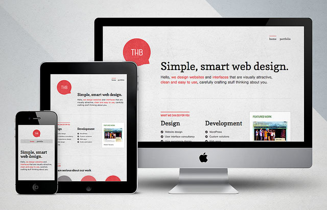
photo credit: The Happy Bit
Responsive Websites – Pros and Cons
While micro mobile sites are easy to design, responsive websites have more sophisticated solutions that make a design complex. The good news is responsive websites detect the type of device a visitor is using, and then presents a website with the proper design optimized for smartphones and tablet PCs. Visitors do not have to adjust screen size or the format of a responsive website. Instead, visitors receive a flawless website presentation, without sacrificing graphics, content, or media. Since mobile devices are exploding in popularity, it is a smart move to base the foundation of a website design on a responsive design.
Major Benefits of Responsive Web Design
- Desktop and mobile content remain on a single URL, unlike micro mobile sites.
- There is no need for Google to crawl both desktop and mobile versions of a website.
- Visitors do not worry about re-sizing a site based on responsive web design.
- Responsive websites provide better graphics, more content and media than mobile sites.
- Users experience an easy and consistent browsing experience on responsive websites.
Why Responsive Websites are Overtaking Mobile Websites
Experts are saying responsive web design is the new trend in 2013. More and more Internet users prefer using mobile devices for their browsing experience. SEO specialists say responsive web design eliminates the need to optimize two different URLs of the same website, streamlining the process of search engine optimization. Therefore, it makes since to an SEO specialist to use responsive web design, which should be a revelation to those trying to acquire more traffic from major search engines like Google.
Google has actually declared their preference towards responsive web design. What is the best option for a business owner? The answer to this question should be obvious. Business owners spending time trying to increase their traffic and PageRank should use responsive web design instead of mobile sites. The world of Internet marketing is currently undergoing a shift towards responsive websites because of mobile device users.
Zachary Yates has worked as a web developer for over 7 years and loves sharing his knowledge with others. Zach recommends finding a web development company that adopts responsive design, such as ClientWhys.com which is a niche company focusing specifically on tax accoutants and CPAs, and he highly recommends doing research in your own niche to find relevant web development companies that use responsive design as well.